Can we talk about the back button?

I am one of those people who is not loyal to a particular smartphone platform. There are some people who say this, but truly, I switch between having an iOS based phone and an Android based phone every couple of years. I feel it is my professional obligation to ensure I am aware of the trends relating to smartphones in general, and so I switch.

I have recently switched to using the iPhone 12 Mini after using Android devices for the last couple of years. I love that Apple has added a smaller phone again to their current range, as I like to be able to fully use a phone one-handed as I walk along. It is great that this phone supports 5G. Unfortunately, I am also deeply missing having a back button on the device.

It is a little bizarre to me that I need to explain this, as I’ve come to realise that some people who have exclusively used Apple iOS devices for their entire lives don’t even realise that Android devices have a back button. This is an on-screen, virtual button (it used to be a physical button) that you can tap to take you to the previous screen you were on, and can keep tapping it until you get back to the home screen. It is conceptually the same as the back button in a web browser. Now, I am aware that some recent Android devices have started to do away with the back button also, but I am choosing to believe that this is just a short-lived fad.

The Android back button is just a simple user interface element, that it is only when it goes missing do I realise how much navigational heavy-lifting it provides. At any point, in any app, you know exactly where to tap to exit the screen you’ve ended up in. There is no need to figure it out based on visual cues that an app might choose to show. Just like in a word processor (or really any application that allows you to create things), you know you can always Undo, and it’s always the same mechanism. There’s not a different way to Undo a typo compared with an accidental deletion or a formatting glitch.

On the iPhone, the way to leave a given screen is up to the app and can be quite inconsistent. The emerging approach is to use the left-to-right swipe gesture, which is quite elegant, although there is no visual indicator that this will work so you need to be told about it, and also be prepared for it not to work at all. It would be great if it simply worked all the time, the way the Android back button does. So, this post is also a little bit of a plea for something like that to happen.

I suspect that people who are regular Android users don’t need to be convinced, so my audience is more iPhone users who don’t realise how inelegant the user experience is. Hence the rest of this post will be actual examples showing what I’m talking about using screenshots from my current iPhone device.

a screenshot of the Messages app on the iPhone

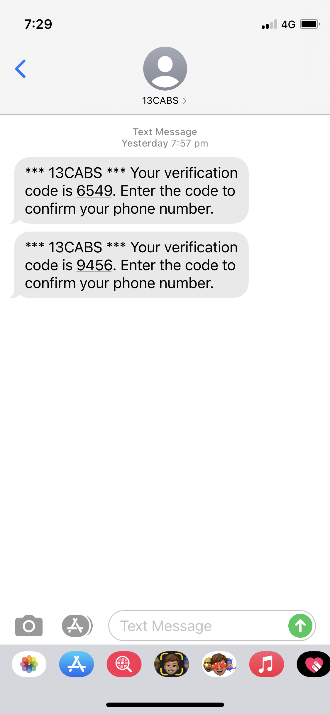
Above is a screen within the Messages app. It has a place on the screen in the top left corner with a “<” symbol so that we know that we can go back to the previous screen in the app by tapping this. We can also do a left-to-right swipe to achieve the same thing. So far, so good.

However, say we arrived at the Messages app by searching for the app rather than tapping on its icon in the home screen…

a screenshot of the Messages app on the iPhone

In this case, there is now also a little label “◀ Search”, that, if we tap on, takes us back to the search box. Tapping the “<” takes us to a different screen in the Messages app, and so does left-to-right swipe. So, it’s a little bit messier, but at least there’s a convention that the “going back” options are in the top-left corner, and left-to-right swipe does the same as “<“. Or maybe not.

a screenshot of the Photos app on the iPhone

This is a screen within the Photos app, displaying a cute pic of my parents’ dog. There is a “<” in the top-left corner to take us back to the photo Library within Photos. However, doing a left-to-right swipe doesn’t do the same thing. Instead, it scrolls to the photos immediately to the left of the displayed photo. So, the swipe gesture isn’t reliable, but is the position of the “going back” option in the top-left of the screen reliable?

a screenshot of the Safari app on the iPhone

Well, this screenshot is from the Safari app, where the “<” symbol is shown at the bottom-left. Although, this little bar of symbols disappears as we scroll through a page, and is shown only when we then scroll up. However, in this case the left-to-right swipe does perform the same action.

Now, tapping on the rightmost icon to show the open tabs…

a screenshot of the Safari app on the iPhone

This takes us to a visual display of the open tabs, but to exit this and return to the previous browser screen, we need to tap “Done” in the bottom-right corner. Additionally, left-to-right swipe doesn’t navigate us anywhere, and risks closing one of the open tabs if we’re not careful. We’ve now found exit prompts in three out of the four corners, but can we find an example of it in the top-right corner? Why, yes.

a screenshot of the App Store app on the iPhone

This is a screenshot from within the App Store app. If you are on the Search screen, and have searched for something of interest, but then change your mind, the only way to navigate back to the main Search screen is to tap “Cancel” in the top-right corner. Left-to-right swipe doesn’t do it either, unfortunately.

There are other examples we could look at where there is instead an “X” symbol or the word “Done” in the top-left corner, and the left-to-right swipe doesn’t work in these cases either. I hope you’ve gotten the idea.

There is no consistency around which corner the “no, I want to stop and go back to where I was before” symbol or word appears, or even what the symbol or word should be. Sometimes the left-to-right swipe works, sometimes it doesn’t, and sometimes it could scroll within the content or even delete it. There is actually an alternative that provides a single, consistent mechanism, and it’s called a back button.

Long ago, in 1987, Apple introduced something called HyperCard, which was software for the Apple Mac computers of the time. HyperCard was a huge thing and has influenced many aspects of computing we still use today, including web browsers. Instead of screens or pages, HyperCard displayed “cards”, and the cards were arranged into what it called “stacks” (although we would call them apps or web sites). Most relevant to our discussion, looking at the HyperCard user manual from 1987, there is this interesting snippet on page 5:

You can always go back: Another way to see the previous card is to press the Tilde key. Stacks in HyperCard often link to each other (a concept you’ll learn more about later). While the left arrow brings you to previous card in the stack you’re looking at, the Tilde key brings you to the last card you saw, no matter what stack it was in.

So, yes, Apple pioneered the concept of a back button. It is time to bring it back.

iPod At Home

I’ve had an ordinary iPod for years, and it’s brilliant for helping me mentally escape the morning public transport crush. Plus it’s great for turning otherwise “wasted” minutes in the day into enjoyable and productive moments when I listen to my batch of podcasts. But, a few weeks ago I bought a new iPod – not to replace the old one, but to leave around the home.

It’s not as crazy as it seems. I bought an iPod Touch, and although it is capable of playing music and TV shows, I don’t intend to use it for multimedia content (I’ve already got an iPod that can do that). It’s primarily an Internet device, and the applications installed on it are almost life-changing.

Whenever I am about to go for a walk, or head to work, or put out washing, I grab it and check the Melbourne rain radar. It takes less than 10 seconds from picking up the device, because it turns on instantly. I would never have bothered to use the laptop for this, but with the iPod Touch it is too easy.

If Kate is watching the TV, I might use it to browse the TV guide of shows that are on other channels, and read summaries of what they are. I often check ahead to see what shows are on that night. Again – I could have done this on the laptop, but it would take minutes to turn it on, boot it up, start up Firefox, go to the relevant website, etc.

I’ve found myself regularly using the Facebook application, which pretty incredible as I rarely used it before. In fact, it has replaced Twitter as my microblogging platform of choice. The app has a couple of bugs and lacks some parts of the full Facebook site, but it is brilliant for catching up on what people have been doing, checking out photos and basically staying in touch.

Also, the web browser on the iPod Touch is as full-featured as a normal desktop web browser (with the exception of having no Flash plugin), and Google Mail has a slick web interface for the iPhone / iPod Touch that performs almost like a native application. The on-screen touch keyboard for the iPod is pretty easy to get used to, and is easier than any phone keyboard I’ve used, particularly when you hold the iPod on its side.

Aside from Google Mail, just using the web browser to search for a website when it comes up in conversation, or when it appears on the TV, or a question just comes to mind.. it is almost trivial to get the information you’re after.

We have also started using the iPod Touch as our de facto digital photo album. All the recent pics are stored in there, and it’s easy to flick through them to show them off to people who visit. It’s better quality than the digital camera screen, and faster to browse. And again, it would take too long to fire up the laptop.

None of these applications is enough to justify the iPod Touch on its own (although, Google Mail and the Facebook app come close), it is really the pure convenience of getting instant access to a wealth of information. It has also provided a sense of connectness to my online friends that I didn’t have before.

There are a few annoying aspects though. Firstly, the web browser (Safari) is prone to crash on several major sites (including The Age) as this is what it does when it runs out of memory. Also, it is pretty slow to synch with the PC since it tries to backup everything. And it doesn’t have the best support for some of the older WiFi security models – it kept on forgetting about my non-SSID broadcasting WEP protected network, requiring me to keep entering the secret key every couple of days.

However, it is an amazing device. Although I’d previously touched on some of the aspects I thought made it revolutionary, I hadn’t appreciated the benefit from the processing power on the device. This provides incredible responsiveness, and together with ability to turn it on instantly, reinforces the sense of convenience. Even Kate thinks it’s pretty cool.

iPhone Innovations

Spectators at the iPhone DisplayIn my previous post, I described the iPhone as appearing to have incremental improvements, but also as allowing the promise of mobile data to be realised. Isn’t this a contradiction? How can minor innovations make such a difference?

I explained how Apple managed to do that with the iPod, compared to other digital music players at the time. It looks like they might have done it again with the iPhone, compared to other WiFi-enabled PDA-phones. Many of these PDA-phones appear to be functionally equivalent to the iPhone: they make calls, play music and movies, manage email and calendars, and allow you to browse the web. HTC has had such devices for a while, and we’ve also seen them from Motorola and Nokia. So, what’s new?

There are basically two types of data that you might want to access when mobile: your personal data, which can be synched to the mobile device; and external data, which these days is made available via the web. The former has been long solved (e.g. iPod) but the latter has been problematic for mobile devices. The main problem is basically that the web has been designed and developed for desktop computers, and not mobiles/PDAs.

Perhaps the most complained about difference between the web for PCs and the web for mobiles, is that on a mobile the web can be expensive and slow. Continual improvements to mobile plans (including caps and bundles), mobile CPUs (along the lines of Moore’s Law), and wireless broadband technologies (such as HSDPA) are addressing these complaints, and will eventually be good enough for this complaint to have little substance. However, for now, increasing numbers of mobile devices, including the iPhone, support Wi-Fi which will provide an equivalent experience to desktop computers in terms of cost and speed. As few people will need to browse the web as they walk or drive, Wi-Fi coverage in hotspots will often be suitable.

No, for the web to work on mobiles, three things need to work equivalently to a PC: input, output and page functionality. The iPhone has brought improvements to what is typical for a PDA-phone, and these are sufficient to gain PC equivalence in these areas.

Most web sites are designed with the assumption that the web browser has a PC keyboard and a PC pointing device like a mouse. The iPhone provides an on-screen QWERTY keyboard, and through its touch screen provides the ability to use your finger as a pointing device. Pretty much all previous touch-screen PDAs assumed that you would use a stylus as a pointing device, but this doesn’t work well on a phone as (i) it means you need to operate the device using two hands, and (ii) it slows the use of the device because before you can do anything, you need to extract the stylus from within the PDA first. The whole UI of the device needs to be completely overhauled if you don’t have the precision of a stylus, e.g. small ‘X’ icons in the corner of a window are too difficult to press to close applications, and scroll-bars along the side of windows are too difficult to manipulate. However, on the iPhone, to scroll a window, you simply wipe your finger along the screen. This is the first time a PDA-phone has managed to provide equivalent input to a PC without needing a stylus.

Most web sites are designed for a screen that is wider than it is tall, i.e. a landscape or horizontal layout. With more desktops and laptops coming with widescreen displays these days, this design principle is likely to become more extreme. However, because PDA-phones need to work when held as a phone, i.e. vertically, so that there is sufficient distance from the ear to the mouth, most mobile devices attempt to display web pages on a screen that is taller than it is wide. When web pages designed for a PC are shown on such devices, the browser either has to (i) shrink the font size so that it becomes unreadable, and needs to support some kind of zooming in-and-out, or (ii) reformat the web page so that it is laid out in a column, which is almost certainly not what the web page designer intended. The iPhone supports vertical display, but also horizontal display; all the user has to do is tip the device sideways. In horizontal display, standard web pages are apparently quite readable.

Most web sites are designed for display on a web browser with equivalent functionality to Microsoft Internet Explorer or Mozilla Firefox. This is not just that it support full JavaScript and dynamic HTML for all that Web 2.0 goodness, but that it supports all the really badly generated HTML out there which is ill-formed and certainly not standards compliant. The Apple Mac has had its own desktop web browser for a while now called Safari, and a version of Safari is included in the iPhone. This should cope with pretty much all those web pages out there that depend on full web browser functionality.

So, that’s it. Three apparently “incremental” innovations – stylus-free touch screen, ability to display horizontally, and a full web browser – are enough to provide an equivalent experience to browsing on the PC. Similar functions have all been seen before, but not quite the same, and not all together. And together they allow the promise of mobile data to be realised.

Legacy of the iPhone

So the world knows that yesterday Apple and AT&T officially began selling that hybrid iPod-mobile phone device called the iPhone. And we’ve had such high expectations of it that even Web luminaries like Om Malik have written that we’ll have to talk about eras Before-iPhone and After-iPhone. I think he’s right, but not for the reasons he lists.

When Apple launched the iPod in October 2001, it clearly changed the digital music business. However, it wasn’t obvious at the time to all technology commentators. For example, CmdrTaco, editor of the popular tech site Slashdot, reviewed it thus: “No wireless. Less space than a [Creative] nomad. Lame.” For to an embittered tech journo, the iPod initially seemed more hype than revolution.

A year earlier, in September 2000, Creative launched a similar music player called the NOMAD Jukebox (or DAP Jukebox in the UK). It was the first widely available MP3 player to use a hard-disk to store its music, and so could store a massive 6GB of music files. A major problem with previous MP3 players was that unlike the portable CD/MD/Cassette players that they competed with, only a limited amount of music could be carried around. Hard-disks had reduced in size, and including a 2.5″ drive in the NOMAD Jukebox was a genuine revolution.

However Apple bettered Creative’s device in three key areas. Firstly, while the NOMAD Jukebox connected to computers using USB 1.1, the iPod used Firewire, which was an order of magnitude faster, and enabled people to upload their music collections to the iPod painlessly. Secondly, the iPod had a 5GB 1.8″ drive, which allowed it to be smaller, lighter, and have a longer battery life (for example, the NOMAD Jukebox advertised battery life was 4 hours, compared with the iPod’s 10 hours). Finally, the iPod possessed many novel design elements, with the scrollwheel (initially mechanical rather than touch-based) and the white earphones being worthy of note, and clearly identified iPod owners from others.

On the other hand, the iPod was initially very expensive, e.g. US$399 compared to US$237 for a typical MP3 player at the time (e.g. Creative Nomad 2 with 64MB in January 2001), was not supported on PCs (it would not be officially supported until July 2002 according to this iPod history), and did not integrate with an online music store (iTunes Music Store would not be launched until April 2003). So you can see why an expensive product, with “only” incremental improvements at best, and targeted at a niche market could be dismissed at the time.

However, even though it was too expensive for most people shopping for a digital music player at the time, it became the aspirational product in its category because its meagre innovations allowed the promise of digital music to be realised: listen to all of my music when on the go. Despite Apple’s previous lack of presence in the market, the desire for both the function and form of Apple’s product forced all other digital music players to follow suit.

So, now we have a similar event: Apple is entering the phone market, which it has never been in before, with one of the most expensive products, which appears to have incremental improvements over innovations already in the market, but there is an incredible desire amongst the public for ownership of it. It allows the promise of mobile data to be realised: access all of my data when on the go. It will become the aspirational mobile phone, and mobile phones to come will need to respond to its function and form.

That’s if it can pull it off. It’s a much bigger task than getting a digital music player right, because it also has to be an effective phone and Internet device. When the user reviews come in over the next couple of weeks, we’ll see how well they’ve done it.