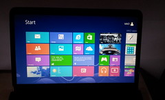
 Our old laptop entered its death spiral a few months ago, but instead of replacing it immediately, we borrowed a stand-in laptop from a kind friend and decided to wait for the slew of Windows 8 compatible laptops that we expected to come in November. Not only would waiting mean that the machines available then be more “future proof”, and cheaper due to competition from other Windows 8 laptops, but we’d be able to pick up (I hoped) a decently-priced touch screen laptop.
Having had the iPad for a couple of years now, and experienced using it with a Bluetooth keyboard, I was completely sold on the idea of a keyboard-enabled device with a touch-screen. The combination of decent keyboard to type with and pleasant touch-based interface is a winner. It also doesn’t hurt that you double the screen real estate by moving from a soft keyboard to a hard keyboard.
So, November came, I put the plan into action, and bought a Sony VAIO E-Series touch laptop for a little over $1,000. It runs a standard Intel i5 processor and comes with a 750 GB hard disk drive. And of course, it had Windows 8.
This post is about sharing my thoughts on Windows 8, having used it now for almost two months. Initially, I was pretty excited with it, but I have since discovered some limitations, so I feel I have a reasonably balanced view of it now.
Major Changes
There are two really big changes that I’ve encountered, coming from Windows 7 up to Windows 8. Many of the other changes stem from these. The changes I’m referring to are: (i) you can now touch the screen to do things, and (ii) the Start Menu has become a Start Screen.
Realistically, Microsoft could’ve introduced native touch screen support in earlier versions of Windows. For example, HP has had this capability on their TouchSmart series of machines. However, it’s not enough for the operating system to be designed around touch if none of the applications are, since controls designed for mouse-based interaction are typically too small to easily manipulate using fingers. So, to introduce touch required Microsoft to push their entire developer community to redesign their applications, and this is logically done together with a major new operating system release.
This may have also spurred Microsoft to redesign their Start Menu. A feature of Windows since Windows 95, it was really a bit too compact for touch and required multiple clicks to navigate which becomes annoying with touch. They could’ve just made the Start Menu bigger and supported scrolling rather than clicking, but instead they took the pretty risky decision to replace the menu with an entirely new screen with a different user interface and its very own app store. Perhaps this understates the level of change. It’s almost as if they decided to replace the humble Start Menu with the entirety of Windows Phone 7.
The Touch Experience
I really love being able to touch the screen. Yesterday I used another laptop without touch, and kept having to pull myself back from touching its screen. It’s not that I use touch at every opportunity: it’s just one way I interact with the interface, along with the keyboard, trackpad and mouse. Some things are best done with a mouse, sometimes the keyboard is best, and some of the time touch is best. This is why I know that eventually touch-screen laptops will become common as those with trackpads.
Windows 8 enables this, but it’s not 100% there yet. Let me tell you about some of the gaps.
When you use touch to control the interface, the mouse pointer disappears. However, since the mouse pointer also used to indicate that the operating system is doing something (a little circular animation appears on it, although in previous versions of Windows it was a sand-timer), having the pointer disappear also leaves me in the dark as to whether that icon I just touched is really launching the program I wanted or whether I was a few pixels out and should really touch it again. Unsurprisingly, sometimes I launch things multiple times. This can get annoying.
It’s not just when launching programs, but any time I try to take an action where there may be a delay. Normally applications rely on the mouse pointer to communicate activity back to the users, so they don’t provide any other indication that things are happening (web browsers are a significant exception). Such applications will need to be rewritten to have an application specific activity indication. Or Microsoft will need to fix this, perhaps in Windows 9.
This tells me that the touch experience was not foremost in the mind of the designers of Window 8. On the contrary, it seems more to be designed around a “keyboard first” principle. Power users are given a range of handy key combinations, and it appears that some of these have been turned into useful gestures, but the whole touch thing isn’t totally elegant.
I find one of the handiest key combinations to be alt-tab, allowing me to quickly switch between applications/windows without having to use the mouse. As this is so useful, this has been converted to a touch gesture: place finger on the left-side bevel outside the screen, swipe to the right onto the screen, then without lifting your finger swipe back to the left. As well as being a clumsy gesture, it doesn’t actually list all the applications since all desktop applications are grouped together.
Another thing is the on-screen “Touch Keyboard”. Despite it being completely unnecessary because this machine is a laptop, ie. it has a keyboard, the Touch Keyboard keeps popping up. It slides up onto the screen when I am logging in, when I’m using Google Chrome, and at other random times. As soon as I touch a key on the real keyboard, the on-screen Touch Keyboard slides away, but I can’t prevent it appearing in the first place. Unchecking the Touch Keyboard Toolbar in the Task Bar properties is a temporary fix, but this resets after rebooting.
Apps and the Start Screen
Despite the Start Screen having the old Start Menu as its heritage, there are two types of application you can start from the Start Screen: (i) Windows desktop applications that we’re all familiar with, and (ii) “apps”. These apps can appear as “live tiles” on the start screen (showing a snippet of content from the full application), a full-screen application with a new touch-centric user interface, or a version of that full-screen application but adapted to fit just a fraction of the screen to allow multiple apps to be on the screen at the same time (not every app necessarily supports this though). These two types of application live in different worlds.
To get new apps, most users will need to use the Windows Store app to discover and download them. Using the Windows Store is like using Apple iTunes or Google Play, and a Windows Live account needs to be set up with Microsoft before you can download anything, even free apps. This was a pain, since I’d set up one of the computer accounts as a local account for our 4 year old and I didn’t want to set up a Windows Live account for them. Another aspect to apps is that they are associated only with one user. Desktop applications can be installed system-wide for anyone to use, but not these apps. So, it also meant that I couldn’t install apps from the Windows Store under my log-in for my 4 year old to use.
This is not a problem on our iPad, where there is no concept of multiple accounts, so I can easily download apps from the Apple App Store and then my 4 year old can get to them. I guess she’s just going to have to stick to desktop applications for now.
There are a range of built-in apps that are available from the Start Screen, eg. Photos, Music, Video. These are similar to Windows Photo Viewer or Windows Media Player, except they are much simpler and have fewer features, so you might be inclined to just ignore them. Unfortunately, they are the default applications assigned to a large variety of file types. I’ve had to go into the Control Panel and change the defaults back to what they’ve been in previous versions of Windows so that I can actually get things done.
I have downloaded a few useful apps from the Windows Store, such as Skype, a couple of games, and a good internet banking app. However, there are strange omissions, such as no official Facebook or Twitter apps, no iView app, and no YouTube app. Given that Microsoft released their operating systems to developers a long time before they made the final version public for sale, it tells me that it wasn’t for lack of opportunity: these major developers have had absolutely no interest in making their services available as apps on Windows 8.
Developers have generally been pretty slow at updating their desktop applications for Windows 8, also. For example, iTunes 11 was the first version of iTunes that officially supported Windows 8 and it came out well after the public version had shipped (let alone when the original developer versions of Windows 8 were available). Google’s Picasa still doesn’t officially support Windows 8.
Concluding Remarks
Windows 8 is a big change from Windows 7, and users are going to go through a learning curve. However, the rapid uptake of Apple iPads by Windows users has shown that they’re quite happy to learn a completely different interface if there’s enough value in it.
For me, the experience of doing tasks on a Windows 8 touch-screen laptop is better than doing them on an iPad. For example, the freedom of using a powerful and modern web browser like Chrome that also has Adobe Flash support means I can get to all the content on the Internet that I’d ever want to visit – there’s little risk that I’ll come across a site that won’t load or for some reason corrupts my form data when I hit submit – and yet I can tap and swipe to my heart’s content so it is a pleasure to browse. When the experience falls down, it is usually when doing things that can’t be done on an iPad, eg. managing multiple accounts, using desktop applications, or multi-tasking.
Yet it is glaringly obvious that the experience must improve. Both application developers and Microsoft will need to update their software to work properly in this brave new touch-enabled world of Windows. Still, what’s available right now is both fun and useful (notwithstanding several annoyances) and gives me confidence that this world is achievable.
That said, if I didn’t have a touch screen laptop, I’d stay away from Windows 8, and if I didn’t have a high pain threshold when it comes to tinkering with my PC (or have someone in my household like this), I’d hold off on Windows 8 until there was more widespread application support, but for me it was worth the wait.
