 I am not a usability expert, but I know people who are.
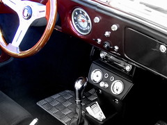
With that disclaimer out of the way, I’d like to take a look at one of the worst designed interfaces we face on a regular basis: the automobile.
Maybe you’ve heard this complaint about SMS, or Qwerty-keyboards, or MS Windows, but it is the common car that astounds me with how out-of-step it is with the current practice of making things as easy as possible to use. Of course, the basic interface of steering wheel, indicator, dashboard, pedals, horn and gear-stick has been with us for a long time. However, technology now allows us to make this interface significantly better, and the fact that we have been able to make usability improvements (such as automatic gears) proves that big changes are possible.
If you take a look at some general usability principles, two important ones are for aspects of a user interface to be consistent, and for the interface to use concepts familiar to the user (including familiar terminology and metaphors). In the computing field, these principles are tried and true, and there are many examples of where they are put to good use.
Menus are a consistent feature of all applications. You expect that certain menus will be present (open, exit, help, etc.), no matter the application. Where menus are in multiple applications, they will behave consistently. All Microsoft Office applications have the same “open file” menu. Because of consistency, once you’ve learned a behaviour about menus in one application, you’ve learned it in all other applications.
Web browsers use the familiar metaphor of a book in their interfaces: there are pages, you can bookmark them, and you can turn back to previous pages. Operating Systems use the familiar metaphor of a office in their interfaces: there are folders that you can store files in, and when you’re done with them, you put them in the recycle bin. In both these cases, the metaphors and language allow the user to utilise previous learning in dealing with the new interface, and enable the user to take educated guesses on how to accomplish tasks (without reading a manual).
However, to drive a car, not only do you need to read up about it, you need to embark on a specialist course of study. In Victoria, before you can take the wheel (and get your “L” plates), you need to read a 170 page book, and pass a written test on it. Then, you before you are allowed out on your own (and get your “P” plates), you need to practise for 120 hours and pass a driving test. And, after all that, the government doesn’t trust you to have really gotten it yet, and for at least the next three years, you’ll be forced to comply with additional conditions.
Okay, I get it. Cars are a little more dangerous than computers. We should be taking every care to make sure new drivers are as prepared as possible for driving, to protect their lives, their passengers lives, and the lives of anyone who goes near a road. But if it is so important to have cars driven as well as possible, why do we deliberately make it so difficult?
Cars are not consistent. You steer by turning a wheel. You indicate by flicking a lever. You break by pushing a pedal with your foot. You honk a horn by pressing a button with your finger. The speed is shown by a dial that goes in a circle clockwise. The clock itself is probably digital. The petrol level is shown by a gauge that is vertical. Also, none of these are consistent with the ignition, the cruise control, the de-mister, the radio, the wing-mirror adjuster, or the door locks. Every function has to be separately learned. Many need to be re-learned for each car (e.g. indicator lever swapped with wiper lever).
Cars are not familiar. Sixteen year olds who get into a car for the first time have no prior experience that they can draw upon to understand how they work. (Unless, of course, they’ve been playing racing games on their games consoles and their parents have forked out for the full set of car peripherals.) Unlike when cars were invented, teenagers now have plenty of relevant and familiar experiences, such as normal games controllers including joysticks, and computers with keyboards, mice, and even touch-screens. Cars could be designed to take all of this into account.
Cars have been with us since the 18th century, and despite some attempts to improve the experience (including some confused or underwhelming attempts) their current usability is clearly not at a 21st century standard. The standard required to gain a full license is an indication of the degree of failure here.
Of course, there is another way to view this. If it is acceptable to require a heavy-weight licensing regime to ensure that users are sufficiently skilled to use a tool that is of such value and widespread in its use, then perhaps the lesson is not for the automotive industry, but for the computing industry. Computers are much easier to use than cars. They are already a tool that can destroy lives. Do they need to be any easier?
 I’m studying a subject called Risk Managment for Finance Sector Enterprises at the moment, so of course it mentions the sub-prime crisis and the global financial meltdown. In a couple of places. However, one of the links provided out to supplementary reading material is a great article about people such as Steve Eisman who knew about the disaster well in advance, called The End of Wall Street’s Boom by Michael Lewis. Here’s a particularly scary quote from it:
